Below is the analysis of the double page spread for my flat plan. I will justify the decisions I made and why, and also what I will change.


Colours
For the double page spread, I will keep the colour scheme limited, as I don’t want it to consist of many colours, as it could look messy. The actual background of the page will be in black, as it will highlight the white text boxes, creating extra emphasis on them. Furthermore, this will give the page a sophisticated look. Key text will be in a different colour, most likely in red, which will also brighten up the page, making it more lively and energetic.
Layout
I chose to keep the layout of this page quite basic, consisting just of a few columns, which are obviously the same length. However, as shown in the flat plan, the columns aren’t the same width, which will need to be changed when it comes to actually creating the double page spread. Furthermore, I might also need to change the position of the picture, moving it somewhere else on the page. Furthermore, at the bottom of the page, on the corners, I will have the name of the magazine written alongside the page numbers, as this is an important feature to have.
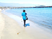
Main Image
For this page, the main image is taken while the artist is walking, in the direction of the camera. I thought that this pose would be a good one to use, as it has a natural effect, because she is actually walking, and the camera is just taking shots of her. Furthermore, this can connote her making her way into the music industry, as she is a new artist. As shown in the image of the double page spread, I made her picture take up just a bit more than half the page, making two text columns beneath it. However, I realised that these extra two columns won’t exactly be needed, and therefore, I’ve decided to get rid of these columns, making the image take up the whole page. I’ve also decided to include a stand - first on the picture, which will give a brief introduction to her. The words included are catchy, making the reader want to read on. Furthermore, I’ve placed her name on the image, which makes it more personal. In this picture, she’s wearing a purple dress, which is different to her outfit on the front cover. However, I may change this, so that she’s wearing the same outfit in both pictures. But, ‘Kiara’ is in a different shade of purple, which matches her outfit. So, when it comes to shooting, I will experiment with this, and see which one is most suitable.
Other Images
An extra image is included on the second page of the double page spread. This is a casual picture of the artist at home, lying on her bed, which again, is a natural pose. This reader will find that the image actually relates to the article when reading it. I chose this picture as I think it’s appropriate, and it’s different to the other images involved in the magazine.
Text / Font
I haven’t decided exactly on what fonts I will be using for the double page spread. However, I will keep them simple, so that it doesn’t distract the reader in anyway. All text will be in black, as I feel that this is the most relevant colour to use for text. I will put quotes and other important information in a different font, or make it bolder, or change the colour and size so that it stands out from the rest of the article.

0 comments:
Post a Comment