I will now evaluate the contents page I created for my flat plan, illustrating a clear analysis of my decisions, and the reasons behind them.

Colours
The colour scheme on the contents page will be a continuation from the front cover, consisting of the same colours, as this will emphasise on the relation between the two, making them look similar and related. The background will be the same colour as the front cover, which is most likely to be grey. This will blend in nicely will the other colours on the page. All text will be in black, however, the page numbers will be in red, separating themselves from the titles and descriptions, so that they stand out, which also makes it easier to understand. Furthermore, this will bring more colour to the page, making it brighter. The background of ‘Contents’ will be in red, highlighting the black text. I haven’t decided on a colour for the text where it says ‘This Month, Smooth Features,’ but it most likely will be red. This is something I will need to experiment on when creating the final piece. The colours within the image will also resemble the rest of the colour scheme, making it all come together.
Layout
The layout of the contents page is organised into different sections, but in a way that doesn’t confuse the reader on what to read first or where to start, as it’s pretty self-explanatory. I decided to have ‘Contents’ written across the top, as many magazines do, and then underneath that, have a brief introduction to the page. I chose to have an editor’s note on the contents page, as I believe that this is an important feature for the magazine to consist off, as it’s a direct message from them to the reader. Furthermore, this will also enlighten the consumer to purchase the magazine, due to the articles within it. This is the smallest text box on this page, making all the others fit equally. The actual contents of the page numbers and articles, begins underneath this continuing onto the opposite side, ending with an image underneath that. It has all been sectioned out equally, in a somewhat column effect.
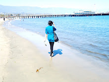
Image
I decided to only have one image present on the contents page. The main reason for this was because due to all the text, there wasn’t actually enough space left to include another picture. However, I’m glad this happened, as I don’t think two images would’ve been appropriate, because it might’ve looked disordered. Some magazines do include more than one image, but due to the fact that I want to bring simplicity to my magazine, I think its best that I only include one image on the contents page. The image itself is quite inviting, as it’s a close up, illustrating facial expressions. The pose is also quite different from the other images that will be in the magazine. This image gives it a personal look, which the reader will discover once they read the article. She’s also wearing a different outfit to the one on the front cover. I’ve decided to change this, so that she is wearing the same outfit, as it will be easier for me, because change of clothing could be a hassle, and it also makes it look more professional. Many magazines consist of the models wearing the same clothes, indicating it took place during the same photo-shoot, which is what I will do too.
Articles
Altogether, there are 11 articles featured on the contents page. Each one takes up a different number of pages, depending on what it’s about, stopping at page 65, which is a relevant number, as most magazines stop around this number. The articles included on the front cover are included on this page, but with different names. All the articles are based on current artists, which will attract my target audience, as they’re also based on a variety of topics, consisting from posters all the way to exclusive interviews with artists. Furthermore, I chose these particular artists as people are familiar with them, which will make them want to read about them. I’ve organised the articles in regards to what they’re about, so that it’s all spread out between the pages.
Text / Font
I haven’t specifically chosen what fonts I will be using for the texts on this page, but like the other pages, I will ensure to keep it simple, as I believe that this would actually make the page look attractive. As it is, there is a lot included on the contents page, and if I was to choose fancy fonts, it wouldn’t give it the right look, and will make it different to the rest of the magazine, taking away the relation between the pages, especially with the front cover. The 'C' for 'Contents' will be in the same form of font as the masthead on the front cover, bringing that quality onto the contents page. The font for the editor’s note will be slightly different to the rest of the text, as it needs to stand out, as do the others. The article titles and the descriptions will roughly be the same font. However, the title will be in capital letters, and bolder than the description, as this is what the reader will read first, therefore, it needs to be eye catching. Furthermore, from the market research I carried out, it showed that 50% of my target audience said that they would prefer to have the extra detail, whereas the other 50% were in opposition to this. Due to these statistics, it shows that not everyone will read the description, so I don’t have to make it stand out as much as the titles.

0 comments:
Post a Comment